**The layouts on this page are from this link: Creative Layout Ideas - Canva.

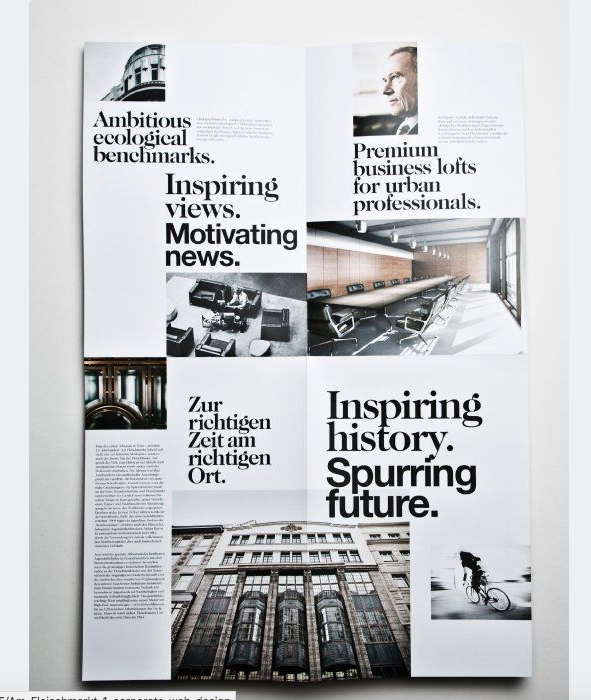
From Canva, I found this layout that I thought was really pleasing and satisfying to the eye. I really like the simplistic shades and colors-black, white, and gold and I plan on doing the same. The problem is, a lot of my personal travel photos have a lot more color and are much brighter which contrasts with this layout that is a lot darker and simpler. Also, many people may find it boring rather than intriguing-which is extremely important in a travel magazine. Something that I will for sure take from this spread is the accent color of gold, and instead use blue. As I've said in a previous blog, blue is perfect for a travel magazine because it reminds viewers of the sky and the ocean.

In the opposite direction, I could have a busier look to my spread and have a scrapbook layout. However, the colors featured on this layout are more vintage and dark, so if I was to recreate it, I would still stick to my color scheme of blue, white, black, and possibly a light green. I really like how the pictures overlap and are spaced throughout the page and I will consider applying similar aspects of this spread (like the pictures) to my own.
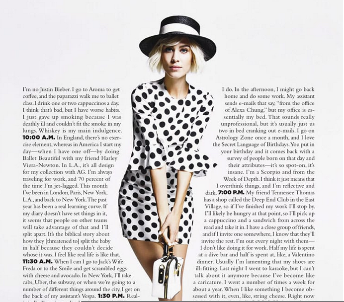
My last inspiration is to wrap text around an image. Since I am making a travel magazine, I thought it would be a good idea to wrap text around historical landmarks of whatever city I want to focus on. For example, instead of the model on the photo below, I would place the Statue of Liberty, Big Ben, or the Eiffel Tower. I really like how easy the words are to follow, yet how creative and unique it is.
I have a tough decision to make between all of the layout ideas, especially since they're all so different. As of now, I plan to get all my photos together, and find out what layout works best for them.


No comments:
Post a Comment