 |
| TOC A |
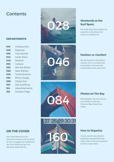 |
| TOC B |
 |
| TOC C |
Let's talk pros:
- I love how TOC A sticks with its primary color--green. The background features a lush green hill and the text "AFAR" copies that color and it works well. Something that I most likely will recreate is how the numbers on the TOC are transparent, and show the background of the water as well.
- TOC B seems to have a blue tint over the entire page, which I think provides a calming and relaxing tone. Since travel magazines tend to stick to this type of blue, I plan on doing the same, but not as a tint and instead as an accent color against white and gold. Something I will use is the white text because it stands out against the blue. I also like the section, On the Cover, because for my portfolio, this is the main story that should be easy to see.
- Lastly, TOC C features a double page spread instead, and has a photo on the left. I am leaning toward a double page spread with a photo on the left and the actual table of contents on the right. But I might incorporate TOC A for the left page of the spread.
Cons:
- For TOC A, I don't like the off white vertical bar or the thick letters, so if I were to design my TOC based on this layout, I would put a skinnier font and change the off white to pure white, gold, or black--depending on my background.
- I did place the blue tint for TOC B under pros, but it looks a little faded. I also would prefer using one big photo instead of multiple small ones, since I don't think my photos are as coordinated.
- ANOTHER BLUE TINT!! TOC C has a blue tint on the tower on the left. Again, I don't think I'll be putting strong filters on my photos because it draws away from the "natural" feel that I'm going for. I also prefer a skinnier font for the text, so it's easy to read without question.


No comments:
Post a Comment