Sorting through photos


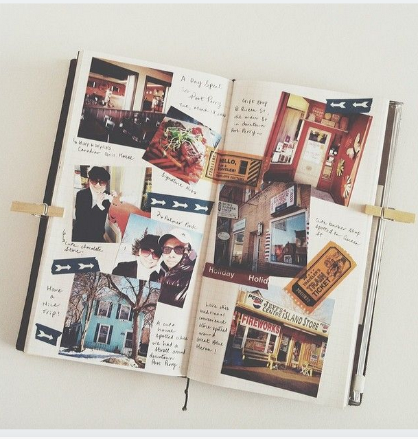
I just sorted through all my my traveling pictures from the past vacations- New York, England, Scotland,
The Bahamas, Jamaica, Canada, and San Francisco. I found 115 great landscape photos of various sites that
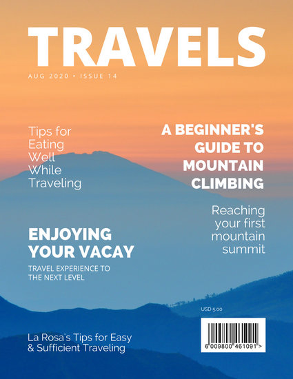
I hope to incorporate throughout my project. The best photos need to be on the cover page, because ideally
this is what I hope draws the most attention. It has been difficult finding the perfect picture but I made it a goal
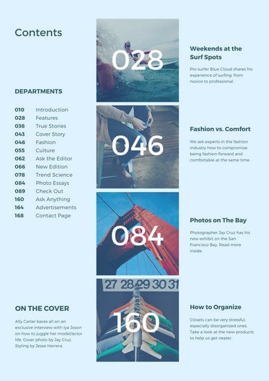
for next week to decide what photos go where. I know I want to have the double page spread more about cities,
so there I can have London, Toronto, San Francisco, and New York photos. Of course, these locations have
buildings and landmarks that automatically let you know what city it is. For example, Statue of Liberty, Empire
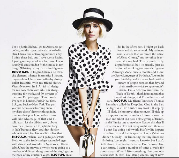
State, Golden Gate, or Big Ben. A few blog posts ago I showed a specific layout featuring a model with texts
surrounding her for the spread, and planned on using one of these buildings instead. As I looked through my
photos I realized that it might not be as easy as I though, because I'll have to photoshop my photos perfectly!
This will be extremely difficult but I'm up for the challenge and I can't wait.

Plans

Being on a deadline is always a lot harder than anticipated, so I want to write down as many final plans as I can, early. As of February 26, 2019, this is what I've come up with:

Cover Page 
- Masthead: Travelogged (Decided against "Europe Up Close" because I won't just be featuring one location)
- Sell line: Around the World in 80 Pages
- Coverlines: Navigating the World's Best Cities, How to Live Like a Local, Last Minute Vacation To Do Lists

TOC 
- One large photo that fills both spreads, but have right page have contents over photo. I combined the three TOC layouts that I saw by taking out my favorite aspects and making it my own! For the photo I might use a photo in the air from a plane OR picture from Empire State of NYC.
- Stick to colors from cover page...BE CONSISTENT

Next week I'll be planning the Double Page Spread and finalizing plans.

Cover Line Ideas

The cover is the most important part of your magazine. This is what consumers see first, but in my case this is what I'll be graded on first. Since I'm an editor for the school yearbook, I didn't think finding story ideas would be hard. I was wrong. I've never written travel stories for the yearbook and I'm having trouble coming up with cover lines. These are the locations that I've been and that I want to feature.
New York
England
Scotland
The Bahamas
Jamaica
San Francisco
Canada

These locations don't really connect with each other...But I came up with some anyways, in case I want to focus on one specific terrain or location:

20 Tips on Navigating the Worlds Best Cities
How to Pack Light for a Weekend Away
Life of a Londoner/ London Life
Last Minute Vacation To Do Lists
Why You Should Cruise to the Caribbean
Live like a Local


All of my coverlines appeal to my target audience, adults in their 20s and up with children. By next week I plan on narrowing down these ideas and choosing which ones to write about. I'll keep you updated!

What to do for Table of Contents!

The next planning aspect of my foundation portfolio is to plan the Table of Contents. I would prefer to have my TOC coordinate with my double page spread, and my cover. However, I haven't decided on my layout yet...so here are my ideas:
Image result for travel magazine table of contents
TOC A 
Image result for travel magazine table of contents
TOC B 
Image result for travel magazine table of contents
TOC C 
Click here to view photos
Let's talk pros:

- I love how TOC A sticks with its primary color--green. The background features a lush green hill and the text "AFAR" copies that color and it works well. Something that I most likely will recreate is how the numbers on the TOC are transparent, and show the background of the water as well.
- TOC B seems to have a blue tint over the entire page, which I think provides a calming and relaxing tone. Since travel magazines tend to stick to this type of blue, I plan on doing the same, but not as a tint and instead as an accent color against white and gold. Something I will use is the white text because it stands out against the blue. I also like the section, On the Cover, because for my portfolio, this is the main story that should be easy to see.
- Lastly, TOC C features a double page spread instead, and has a photo on the left. I am leaning toward a double page spread with a photo on the left and the actual table of contents on the right. But I might incorporate TOC A for the left page of the spread.

Cons: 
- For TOC A, I don't like the off white vertical bar or the thick letters, so if I were to design my TOC based on this layout, I would put a skinnier font and change the off white to pure white, gold, or black--depending on my background. 
- I did place the blue tint for TOC B under pros, but it looks a little faded. I also would prefer using one big photo instead of multiple small ones, since I don't think my photos are as coordinated. 
- ANOTHER BLUE TINT!! TOC C has a blue tint on the tower on the left. Again, I don't think I'll be putting strong filters on my photos because it draws away from the "natural" feel that I'm going for. I also prefer a skinnier font for the text, so it's easy to read without question. 

Ideas for my Masthead

After I thought of ideas for layout, I realized I don't even have a title of my magazine yet! I came up with these:
- Around the World in 50 pages
- Travelogged

- Europe up Close
I think that Around the World in 50 Pages would be really good for a sell line, to place under my masthead. Travelogged to me, doesn't sound as appealing but for Europe Up Close I would be restricted to a specific continent. I'm still not sure where exactly I plan on focusing my spread on and wouldn't want it to just be Europe since I've only been to a couple European countries. Others places I have been to are many Caribbean Islands, a handful of US States, and Toronto, Canada. Since these locations are so varied, it's hard to fill in the blank: ______ Up Close. I decided that in order to pick a masthead, I should try out different fonts and colors with the names and pick whatever looks the best! When I researched some travel magazine covers, most, if not all, had the word "Travel" in it. Here are some examples from Google Images
Image result for travel magazine mastheadImage result for travel magazine mastheadImage result for travel magazine mastheadImage result for travel magazine masthead
Since I do want to stick to genre conventions, it might be a better idea to have "Travelogged." But I'll keep you updated after I test out some fonts. 

Layout Plans

Before I begin working on my magazine, I've utilized different layout websites and compiled a bunch of examples to take ideas from. I wrote pros and cons of each below. 
**The layouts on this page are from this link: Creative Layout Ideas - Canva
 Create Layout Ideas - Canva

From Canva, I found this layout that I thought was really pleasing and satisfying to the eye. I really like the simplistic shades and colors-black, white, and gold and I plan on doing the same. The problem is, a lot of my personal travel photos have a lot more color and are much brighter which contrasts with this layout that is a lot darker and simpler. Also, many people may find it boring rather than intriguing-which is extremely important in a travel magazine. Something that I will for sure take from this spread is the accent color of gold, and instead use blue. As I've said in a previous blog, blue is perfect for a travel magazine because it reminds viewers of the sky and the ocean.


In the opposite direction, I could have a busier look to my spread and have a scrapbook layout. However, the colors featured on this layout are more vintage and dark, so if I was to recreate it, I would still stick to my color scheme of blue, white, black, and possibly a light green. I really like how the pictures overlap and are spaced throughout the page and I will consider applying similar aspects of this spread (like the pictures) to my own. 


My last inspiration is to wrap text around an image. Since I am making a travel magazine, I thought it would be a good idea to wrap text around historical landmarks of whatever city I want to focus on. For example, instead of the model on the photo below, I would place the Statue of Liberty, Big Ben, or the Eiffel Tower. I really like how easy the words are to follow, yet how creative and unique it is. 


I have a tough decision to make between all of the layout ideas, especially since they're all so different. As of now, I plan to get all my photos together, and find out what layout works best for them. 

Travelogged: Cities of the World Edition

My city edition of Travelogged is finally complete! So excited to share it: The link: https://drive.google.com/fil...