CCR Script

I've been working on my CCR script all night and I finally finished! I made sure to include the fundamental parts of my magazine and detailed descriptions of why I made certain decisions and what I would plan on doing for marketing ideas. Tomorrow morning,  I'll be making an audio recording of myself over a screencast of certain parts of my project. Here's a sample of a part of my plan and an outline of the CCR:

"After this decision, I quickly came up with a name, Travelogged. Right from the start of my research, 
I found out that most travel magazines have somewhere in their masthead the word “Travel.” Sticking to 
these conventions, I looked online for good blog titles and decided to go with Travelogged."

While on Vacation...

Hi!! This week I've been on spring break, driving around the country and visiting colleges. While driving through cities like Atlanta, Raleigh, and DC, I managed to take some pictures and edit them for my magazine. Here’s what I plan on adding to my second double page spread (yes I decided to have another spread!


I'm especially excited to add this spread because I’m including quotes as well. I’ll be asking some family members and friends who have gone to these places any tips and I'm going to include a Q&A type module on the second spread. This way I can have the pictures but also add a different sources to provide more information for my consumers. This is what the spread looks like!!:


I really like how it matches with my other spread, but the background shows its different. On the top left I have the city name with pictures and a template of a potential Q&A.
 So with that said, I’m pretty much finished with my magazine once I interview my peers for some quotes!! It’s been so much fun and this project has helped me be more creative and imaginative. Also it’s helped me implement some ideas and revise them to make them better :) So thanks Foundation Portfolio for an amazing experience. Sad that it’s almost over!

DBS Production Process Part 3 - Drafting my Article

The first thing I did was research what aspects cities have in common. I came across another blog from Daniel Little, a travel blogger, who wrote a list on what cities share in a philosophical point of view. Even though my magazine won't be that deep, I still took certain points from his blog. I then researched any tips from Google that could inspire me to think of my own tips. Once I started writing, I couldn't stop. I would think of any tips my dad tells me during vacations regarding how to get somewhere. Using instances, many instances, in which I got lost on vacation, helped me write a well developed list of tips that I think will actual be helpful. Here are some of my tips!
  1. Pay attention to landmarks or memorable corner stores. Chances are directions from locals will include, 
    “Turn left on the second stoplight after the Starbucks.”
  2. Count! The grid system is based on numbers.
  3. Become familiar with transport system. Whether it’s the Tube in London or the BART in the Bay Area, 
    utilize these cheaper ways to get to work. They’re there for a reason!
As for placement of my article, I put it in the gold backgrounds and just listed my tips. Here's what my layout looked like after just pasting my list:
Since it looked so boring, I decided to make the numbers bigger so its more appealing, rather than just a list. I also changed the font to script and changed the color to white!
Here's what my spread looks like now and I love it so much. I did this twice with the rest of the tips for my second page spread! I'm really happy with how it looks but obviously I have a few edits to make and to make sure I achieve that one goal I talk about constantly- ORGANIZATION!! I really want my entire magazine to look neat, organized, modern, and simple, yet appealing, intriguing, and interesting. Also to make my magazine look even more put together, I might write another double page spread if I have time. I think it would all go together even more if I add another spread.


DBS Production Process - Part 2: Editing Photos

A couple of days ago I asked my close friend to play around with editing some of my photos on the app VSCO. I've been telling her about my magazine and she helped me find the perfect filter, the perfect range of exposure to brightness, and which photos I want to use. The first thing she edited was this photo of the Statue of Liberty:

Before ^^ 


After ^^
I really like how it looks a lot brighter, and the blue tint looks really good with my theme.
But I'm worried that it looks too purple and the other pictures won't look good with it. So I put the filter on some other pictures too to see how it would look.

Here was the process:
I first edited the saturation to +1.0 to brighten the picture, but not take away from the rest of the elements on my page:

Then I put contrast to +1.5, to also clear up the photos and highlights:

Next I put my exposure -0.8, which allows more light in the photo:

The last step was adding the filter: C1!!

I think this photo was definitely one of the best edits because the filter makes it look so cool. Some of the other photos looked too dark, or too bright with these presets, so I did have to alter it. But I thought I would choose this picture to edit because the colors look so amazing!!

Double Page Spread Production Process Part 1 - Deciding Templates and Layout

Now, it's time for the hard part. The double page spread allows Cambridge to preview what the actual magazine content would be like, and I want it to look like it could be successful. As usual, I want to keep my theme modern and I want it to match the rest of my magazine. Matching as been the hardest part and my biggest doubt when constructing the the cover and TOC and now for my double page spread. The templates I'm deciding from are these:


I utilized shapes again for the blue and gold background spreads and I also used the colors that I really liked. For the page with the big picture, I think it looks to traditional and might come off as boring- something I'm also afraid of! But sometimes I think following the traditional layout might be beneficial since it follows typical genre conventions. Regardless, I chose to do the gold and blue spread because the pictures are big (which is the main attractive aspect in travel magazines) and the spread is modern, and it's easier to have a second page without looking boring. Since my spread has to be double paged, I reversed the layout for the second page so the pictures were on the left. Put next to each other, it would look like the pictures are in the middle, and the copy is on the outside. The first thing consumers will see is the pictures, which will ultimately draw their attention. The "Guide for the Grid" spread is only if I have enough time to write another article. I chose these two for the double page spread since they're both connected to each other so there's more of a connection. Next class I'm going to draft my stories and edit photos to wrap up the project. This month has gone by so fast and I can't believe I'm almost done with this process!!

Revising My TOC

With only a couple weeks left until my foundation portfolio is due, it's critical to get as much done as possible, especially since I'll be out of town during Spring Break. Before I begin the next step of my project, my double page spread, I want to fix anything from the TOC from last week. The first thing I edited was my page numbers. Originally I numbered the pages 1-20, but I failed to consider that not every page has an article in typical magazines. For my genre, travel, the magazines are filled with photos of attractive locations, not just articles. Also magazines are around 100 pages, so I spaced out the numbers of my table of contents and any article that was just a list, I would only put it on one page. But, if it was a multi part spread or article, I would space out the pages more. I ended at 84 pages because my sell line says "Around the World in 80 Pages." I also put a dash (-) in front of every summary so the title of the article and summary can be differentiated. Another change that was extremely beneficial was to zoom in on the spread and fix any spacing problems or text alignments. By zooming in I was able to notice small changes that helped keep my magazine organized. I'll do the same for my Double Page Spread!!

TOC Production Process Part 3 - Deciding Pictures and Titles

So, I already discussed which photos I am using for the TOC and how they correspond with the colors in my last blog. But regarding titles, I managed to move things around to fit the 5 "On the Cover" coverlines on the first page of my TOC:


The process took me basically all class and I only got one page done so far. This page was easier since I know what coverlines to put. I also chose to put the pages in number order because if you couldn't tell already, I love organization and order. The summaries are short and concise under the titles that are enough to grab your attention, but don't take away from the article itself. For example, for Life of a Londoner, I just wrote that it was a day of the life of a London teen and included adjectives like bustling to connote excitement. I also used the same font for all summaries and titles and kept it as neat and pleasing to the eye as I could. However, one of my favorite aspects of my Table of Contents is the bottom teaser "Adventure Awaits..." This works so well with travel genre conventions of seeking new experiences at just the flip of a page. Next I have to come up with more titles and enticing topics to write for the second page of my TOC that have to do wit my (now) city theme. Some that I wrote down were Underrated Cafes and Restaurants and tips on quick transportation 
I'm super excited about how the TOC is looking so far but I'm looking forward to the double page spread that I'll work on next week. 

TOC Production Process Part 2 - Deciding Fonts and Colors

Ever since the beginning of this process I wanted to use white, gold, and blue as my color scheme. It's kind of hard to stick to gold, since it doesn't really correlate with typical travel conventions. But since one of my locations, London, features Big Ben, I used that picture to pull out the gold so the second page of the TOC would match. The first page of TOC was a photo from San Francisco, in Union Square, which brought out the blue that I wanted for my theme as well. Here's what the colors look like with the (unedited) photos! I want to use these colors for the double page spread as well.


The two top pictures, which I also took of course, was from an airplane window. One was when I flew to The Bahamas and the other was when I flew to Jamaica, so I had a lot of ocean to work with.

For fonts, I already knew that I wanted to use the script font and I really like the way it looks. I used the script font for the masthead and I want to use it throughout the double page spread too. It's really elegant and works well against a modern theme. So I used the script font to write "Contents" with the designated colors from the shapes and photo:


When I post the entire magazine, you'll be able to see how the colors all compliment each other as you flip through the TOC. I'm very excited to work on the double page spread too, because I want it all to coordinate.
Lastly, I'm using the same font that I wrote coverlines with, to show the summaries and titles of my articles.

TOC Production Process Part 1 - Deciding Templates

From peer feedback last week, I got great advice to implement shapes for my TOC with locations in them. So here are a few templates I've been working on!


Since I couldn't find a template that would allow me to place shapes in the middle, I found this layout pack called White Minimalist Travel Magazine on Canva. This name might seem familiar since the cover layout was one of my considerations.I really like the simplicity of the shapes and for my second page of TOC, I can reverse the words and the photos to opposing sides. I'm not sure how I'm going to write article titles on the text column but there's a lot of space to come up with something.


I found this template during research and I complained about the tint. SO I changed the background to white, removed the template photos and text and started from scratch. I tried to change the pictures to white but since the background was white...you couldn't see it. I also couldn't find out a way to place photos in the shapes without cutting off too much of the photo, and I tried to add transparency to various triangles and squares but they wouldn't fit as neatly as I wanted.
Instead I'm going to use the White Minimalist Template (below) and next class I'll figure out the various aspects to designing it!


Quick Edits!

It's week 4 of the planning process and I'm very excited to start part two of my project, the table of contents!!! Before I start the TOC I want to quickly revise the cover. First thing I changed was the main coverlines. I thought that they looked a little awkward in the middle of the cover so I changed the font and instead of Lato Heavy, I changed it to Lato! I also changed the placement of the main coverlines and placed them on the railing from the picture. This adds a creative element to the cover but also keeps its simplicity and modernness--which I'm really proud of. But what I spent the most time on was editing the masthead. I want the font to go with the rest of the page and spreads, but if it's the same font it might look to bland. My peers preferred the font, "Voga," yet I prefer "Script". (I showed what these fonts looked like in an earlier post.) For now, I kept script since it matches the contents font, but I might change it again, who knows...

Cover Production Part 3- Deciding Pictures

These are the main photos of city that I plan on including throughout my magazine. Since I already have the cover picture, for the TOC I might use a picture from a plane window to go behind the shapes. But for my double page spread, I'll include these photos!! After I design pages, I also want to edit them, so the pictures look uniform and organized. My friend, Jack who is also doing a magazine, offered to help me edit photos using the app VSCO. I'm usually really bad at editing and hopefully with his guidance it can all come together.
New York City
Edinburgh, Scotland
San Francisco, California
London, England 
Toronto, Ontario

I chose these photos because they show a variety of cities each with their own characteristics, yet there's a sense of similarity with the structures and the buildings. For the spread I'm not sure how many pictures I want to include (this will depend on formatting and editing) but as of now I have a sense of direction in what I want and I'm looking forward to putting my plan into action.

Peer Feedback Session!

In class today, I shared my cover page with a group for constructive criticism. I showed them my cover page and made some adjustments:
Instead of having all cover lines at the bottom, I'll place my main one in the middle of the sky so it won't look too plain, and the main stories will stand out. I should also keep the overlapping of the text, but change the font to resemble the "Adrift" template font. *See earlier post!!
This is what my cover looks like now! I changed the cover fonts to Vogo and Lato Heavy. (which means my last font post has been completely revised!!!)


I also got some tips on my TOC too to keep to a modern theme. Something that I will keep in mind for next week when I construct the TOC spread is to put the titles on geometric shapes with white space in the background. I really appreciated this idea and can't wait to test it out. The last comment I received was a compliment on the cover photo so in my next post I'll find more photos for the other spreads.

Cover Production Process Part 2 - Deciding Fonts

In my last post, I discussed what I liked and disliked about each template-- one element being the font. Today I will continue editing the template, but now I'll focus on the numerous font options. It might not seem like it, but fonts are VERY important in magazines. Through research, I found out that travel magazines with a hand drawn, narrow letters, are "friendlier." It's more casual and relaxing, which I think goes with my theme. But, hand drawn cursive letters are more elegant and stand out. So here is what those type of fonts would look like with my Masthead. The fonts below resemble handwriting and they're called Kalam Light and Amatic SC: 


These fonts are nice, but they aren't as appealing or attention-grabbing. I googled "Handwritten fonts from Canva" and found "Script." Here's what it looks like!!

Script:
Although, the font doesn't really go with the modernness of the rest of the cover, I still really like how the G and R's are curved at the bottom, making the entire title stand out. I'm considering altering the cover to the second spread so it can look like this:

I also edited the cover lines on the bottom, so the main cover story is the biggest and relevant to the photo. Something I will consider next is colors for the fonts, because I want to make sure those reading the cover can clearly see the coverlines!!

Cover Production Process Part 1 - Deciding Templates

Today I'm starting the production process for my magazine and I'm implementing all of the tips, tricks, and ideas that I've previously researched. This week I plan on working on the cover of my magazine. Since I've had experience with canva.com I'm going to use it to make my magazine spreads. As I was scrolling through the templates, I came across the "Magazine Cover" which obviously fits perfectly! I also download Canva onto my phone so I could upload all of my photos easily. Something else that helped me get started on the process was this website: https://www.canva.com/learn/how-to-recreate-a-magazine-layout-from-scratch/
Canva has a step to step guide for magazine designing which I plan on using.

White Minimalistic

I LOVE this layout for the cover because the white lines and shapes make it very organized and pleasing to the eye. I also love how the blue looks from the photos against the white. The only problem is anywhere where I put coverlines might look awkward and take away from the simplicity.

I wrote in the information that I wanted for the cover (I wrote this in an earlier blog titles Plans)
and this is what it looks like:

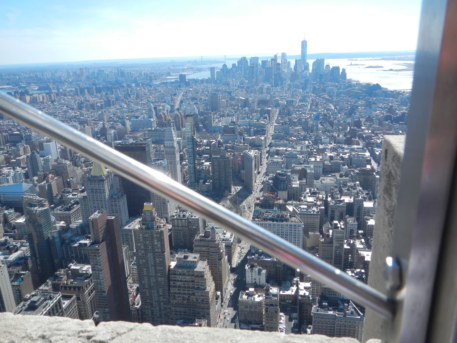
My thoughts: I couldn't find a better picture to use for the background because I didn't have any that complimented the smaller picture, so I decided to place the same picture in the background but just blur it. I took this picture on the Empire State Building in New York City! Canva gave the option to edit photos on its software, but I think I'm going to use VSCO because I know it has a wider variety of filter options. Something else that I don't really like from this cover is the awkard spacing on the top. The masthead and sell line are very far from each other, and I will make sure to revise it. Another con is the main cover story isn't differentiated from the others. This is because when I tried to change the color or font of the first title, it wouldn't match the background well enough or it would blend in and be hard to read. Also the text at the bottom matches the sell line but I still prefer having one single font for masthead, coverlines, and sell line. 

**Again, this is just a rough draft to see what the cover would look like, obviously I still need to do some editing and comparing. 

Here's my second option template: 

I don't like the font at the top but I do like the white box outline around it and how the Masthead covers the photo. This is what my magazine would look like with the Adrift template: 


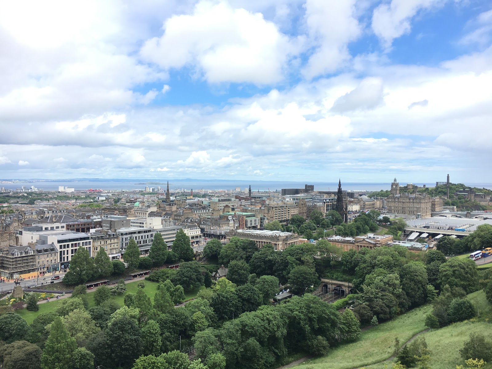
I really like the coverlines at the bottom of the cover, but I don't like the masthead font because it blends in with the railing of the picture. I think as a compromise I might use this template but the same masthead font from the first picture! I also might include the double overlaying picture if I can because that is one of my favorite aspects of the cover! My next task is to focus on what fonts I want to use and playing around with the options! 


Travelogged: Cities of the World Edition

My city edition of Travelogged is finally complete! So excited to share it: The link: https://drive.google.com/fil...