 | |||
| Before ^^ |
 |
| After ^^ |
But I'm worried that it looks too purple and the other pictures won't look good with it. So I put the filter on some other pictures too to see how it would look.
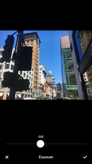
Here was the process:
I first edited the saturation to +1.0 to brighten the picture, but not take away from the rest of the elements on my page:
Then I put contrast to +1.5, to also clear up the photos and highlights:
Next I put my exposure -0.8, which allows more light in the photo:
The last step was adding the filter: C1!!
I think this photo was definitely one of the best edits because the filter makes it look so cool. Some of the other photos looked too dark, or too bright with these presets, so I did have to alter it. But I thought I would choose this picture to edit because the colors look so amazing!!


No comments:
Post a Comment